Here is a table from the US Environmental Protection Agency from a few years ago. What are the problems with this table?
| Source Sector | Total Emissions |
|---|---|
| Electricity Generation | 652,314 |
| Fires | 14,520,530 |
| Fossil Fuel Combustion | 1,499,367 |
| Industrial Processes | 2,414,055 |
| Miscellaneous | 33,786 |
| Non Road Equipment | 22,414,896 |
| On Road Vehicles | 62,957,908 |
| Residential Wood Combustion | 2,704,197 |
| Road Dust | 0 |
| Solvent Use | 3,294 |
| Waste Disposal | 2,018,496 |
A better version of the table (font, background, alignment):
| Source Sector | Total Emissions |
|---|---|
| Electricity Generation | 652,314 |
| Fires | 14,520,530 |
| Fossil Fuel Combustion | 1,499,367 |
| Industrial Processes | 2,414,055 |
| Miscellaneous | 33,786 |
| Non Road Equipment | 22,414,896 |
| On Road Vehicles | 62,957,908 |
| Residential Wood Combustion | 2,704,197 |
| Road Dust | 0 |
| Solvent Use | 3,294 |
| Waste Disposal | 2,018,496 |
Here is a sample table with two values: Yes/No.
| Yes |
No |
Yes |
Yes |
Yes |
| Yes |
No |
No |
No |
Yes |
| No |
Yes |
Yes |
Yes |
Yes |
| No |
No |
No |
No |
Yes |
| Yes |
Yes |
No |
No |
Yes |
A better version would be:
| Yes |
- |
Yes |
Yes |
Yes |
| Yes |
- |
- |
- |
Yes |
| - |
Yes |
Yes |
Yes |
Yes |
| - |
- |
- |
- |
Yes |
| Yes |
Yes |
- |
- |
Yes |
Using color to highlight the pattern (one color):
| Yes |
No |
Yes |
Yes |
Yes |
| Yes |
No |
No |
No |
Yes |
| No |
Yes |
Yes |
Yes |
Yes |
| No |
No |
No |
No |
Yes |
| Yes |
Yes |
No |
No |
Yes |
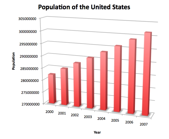
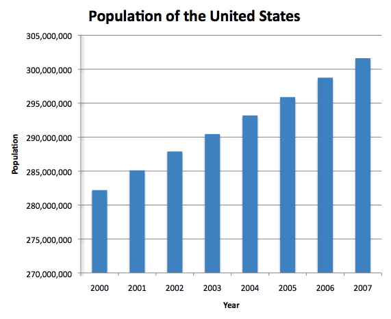
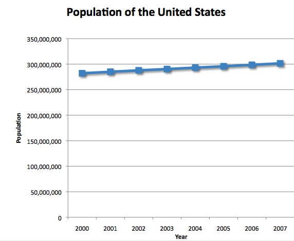
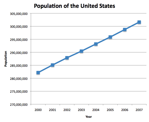
This is the bar charts of the population of the USA over the last 8 years. The left chart shows how 3D hurts the visualization. The right chart is a less fancy but much more effective in 2D.
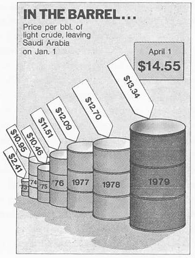
Here is an example how visualization lies: from Time Magazine (4/9/79) via Tufte. Please avoid this.
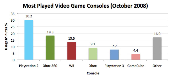
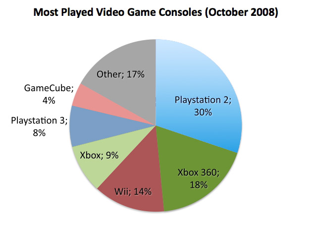
These examples are charts from a recent version of Excel. 3D distorts the view making it more difficult (less accurate as well) to read the visualization.
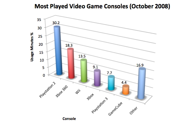
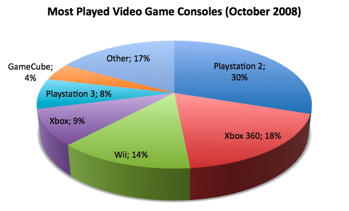
A 2D version is much better. Picking up the right colors is also helpful: we could use colors to relate consoles. For example, Playstation 2 and Playstation 3 are both in (darker and lighter) blue.
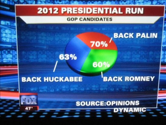
Here is another bad example from Fox news: